How can I avoid CLS (Cumulative Layout Shift)
You may have noticed that when the Countdown Timer Bar loads, it causes the page to shift down slightly to accommodate the space it needs to display.
This is due to the design Shopify has chosen to use for loading pages. First, the core Shopify content loads; after that, the apps are loaded in the order they were installed. So it's only after the page has loaded that the Countdown Timer Bar is inserted, causing the layout shift.
If you are looking to avoid this shift, a possible solution is to insert the bar manually into your theme and include styling code to make space for the bar's contents.
Given that themes are all designed a little differently, it's difficult to create a step-by-step guide for all themes, but hopefully, this guide for Dawn can get you pretty close.
Note:
This is a general guide and may not apply to all themes. It is provided as a tool for merchants and their developers to overcome CLS issues.
Before we begin......
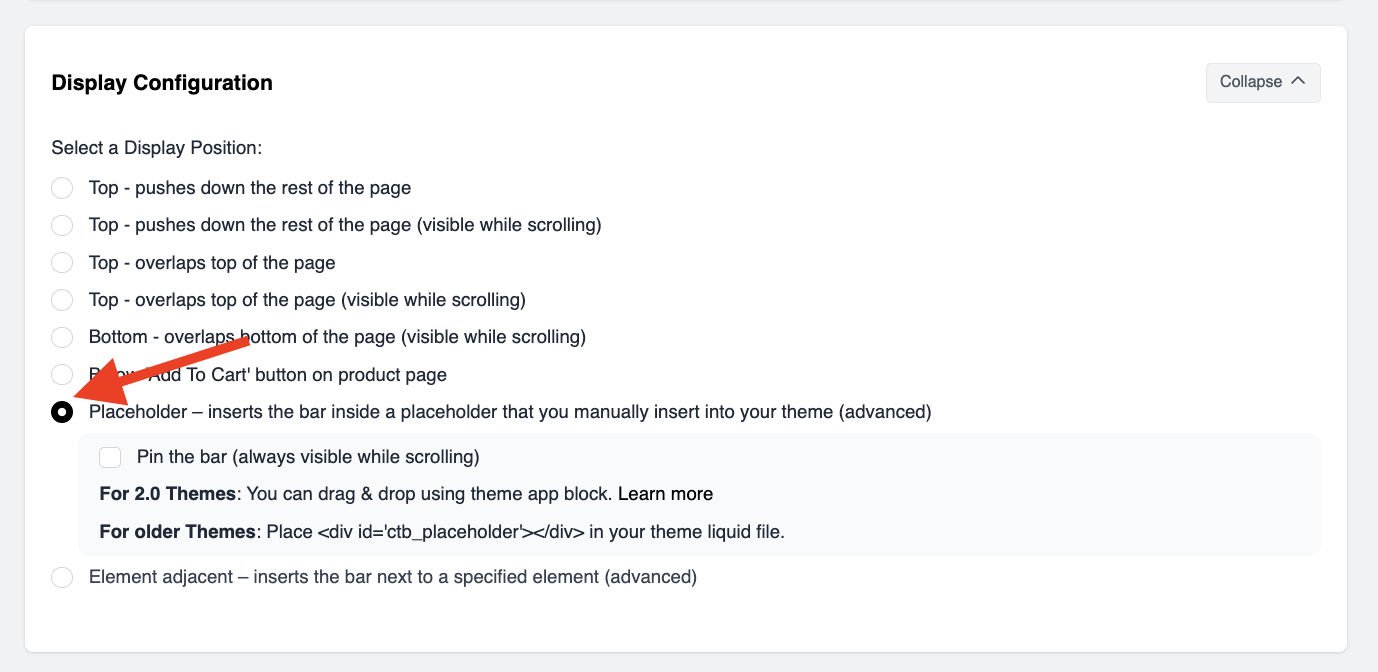
Ensure that the bar is set to the Placeholder display position and then save the bar.
This can be found in the Display Configuration part of the bar campaign:
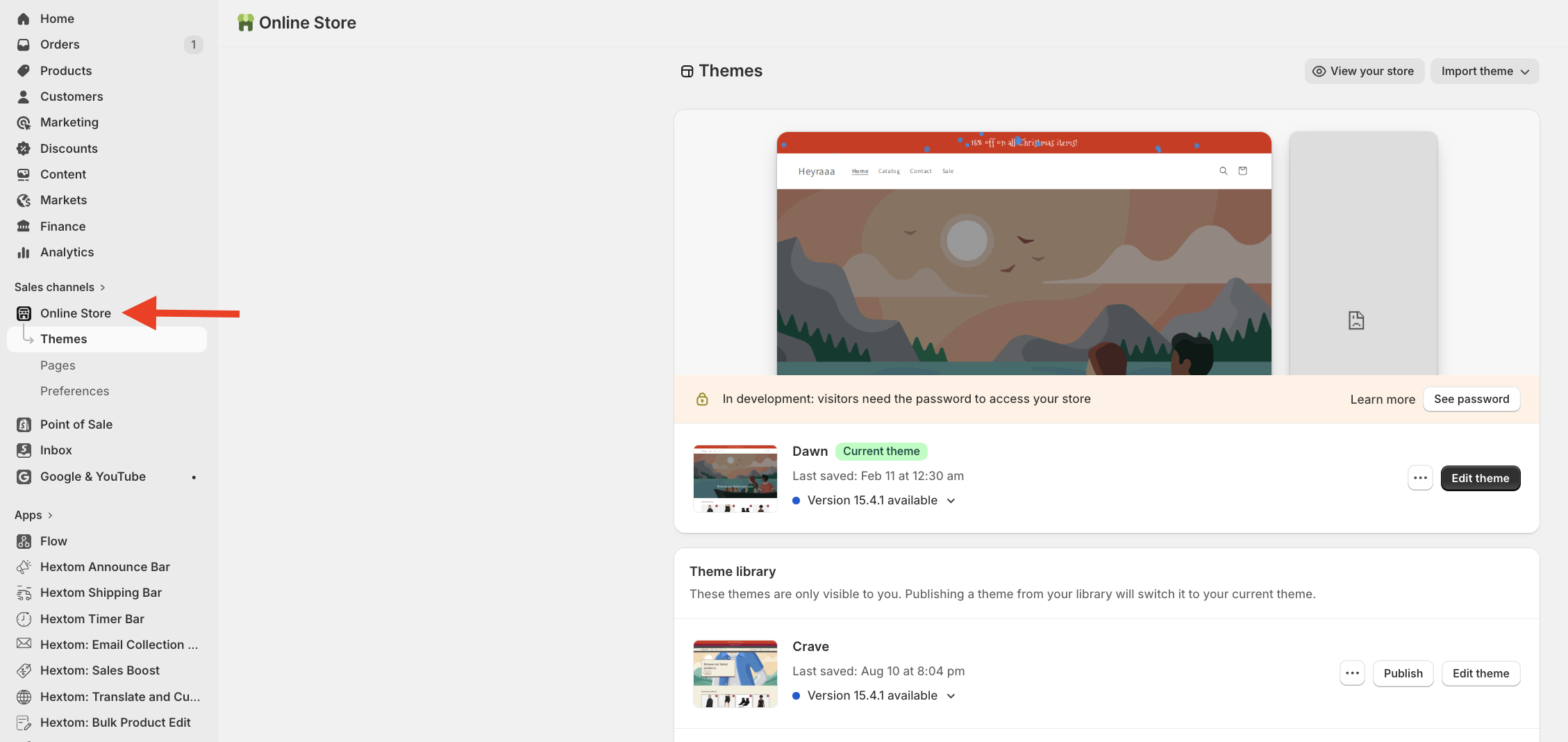
Accessing the Theme Code
To begin, you'll need to get into the code editing space.
- Click on Online Store
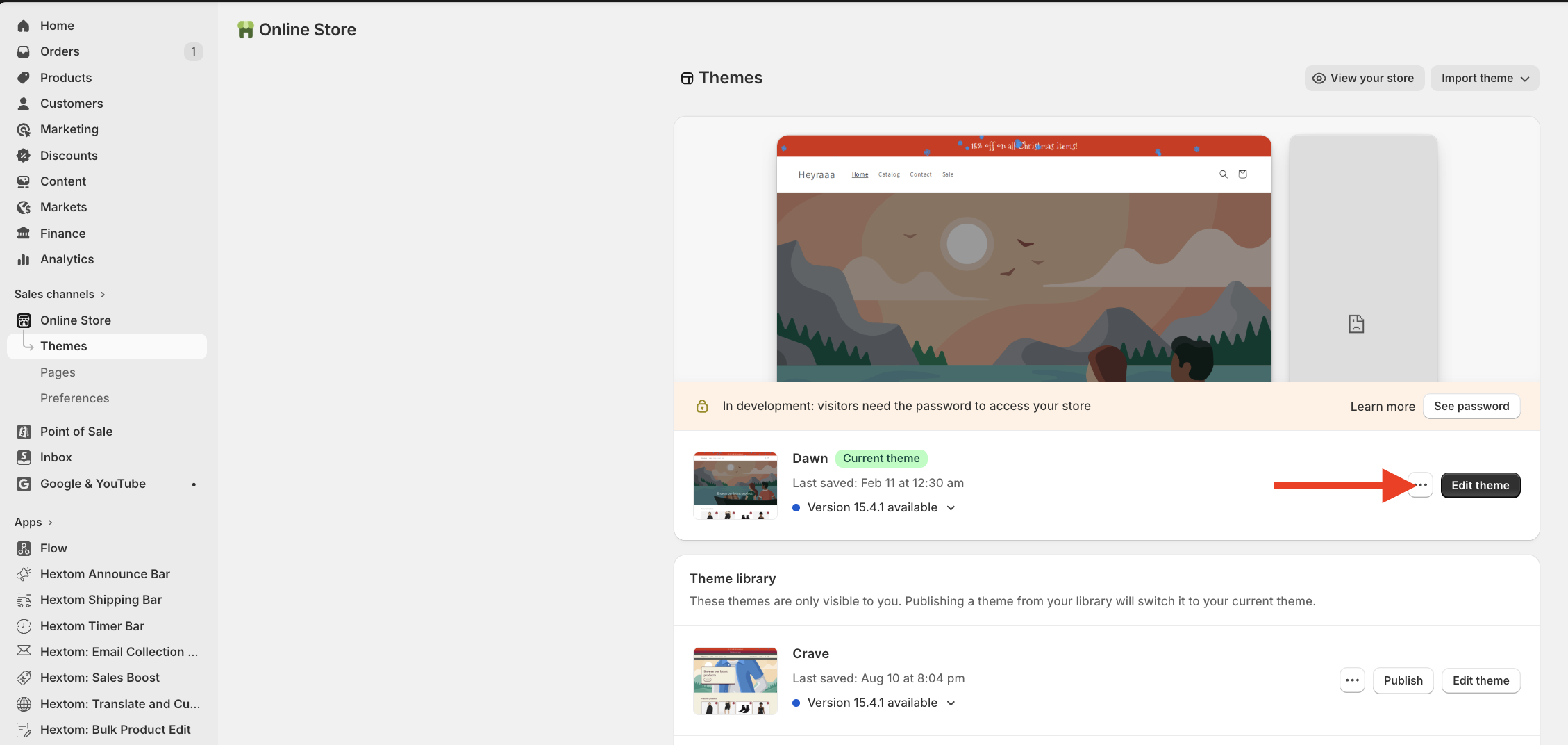
- Click the ellipses drop-down (on the right side of the page):
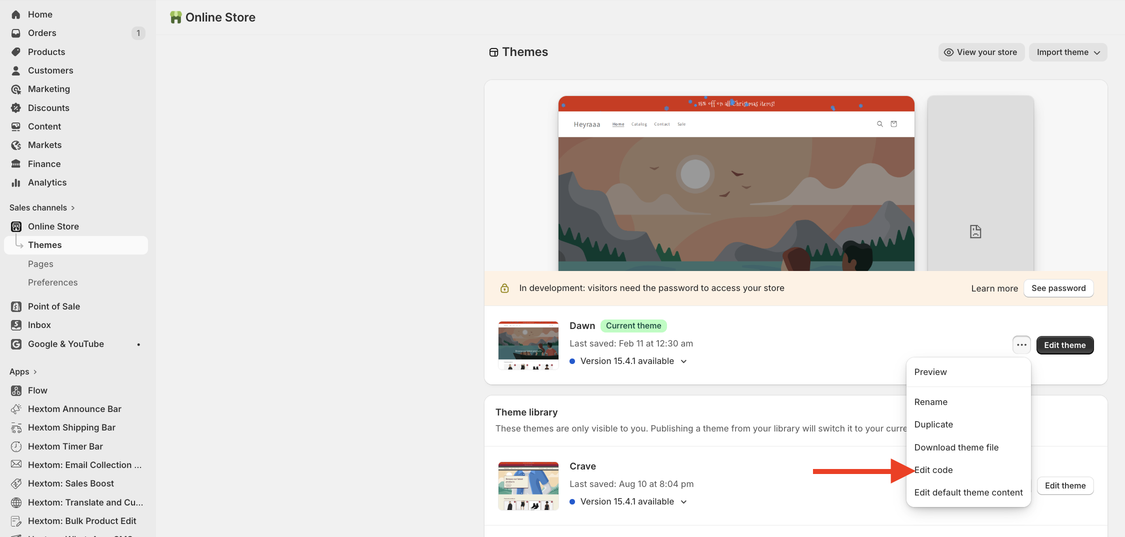
- Click Edit Code
From here, you can choose if you prefer the bar to scroll with the page or not.
Note: Both options set up the theme to create a space that the bar will fill when it's loaded. If the bar is a little bigger or smaller, the space will adjust. You can edit the sizes from 33.5 or 44 to whatever value fits the bar that you've designed. 33.5 is for mobile view, and 44 is for desktop.
Keep the bar at the top (non-scrolling / non-sticky):
- Click on theme.liquid found inside the Layout folder.
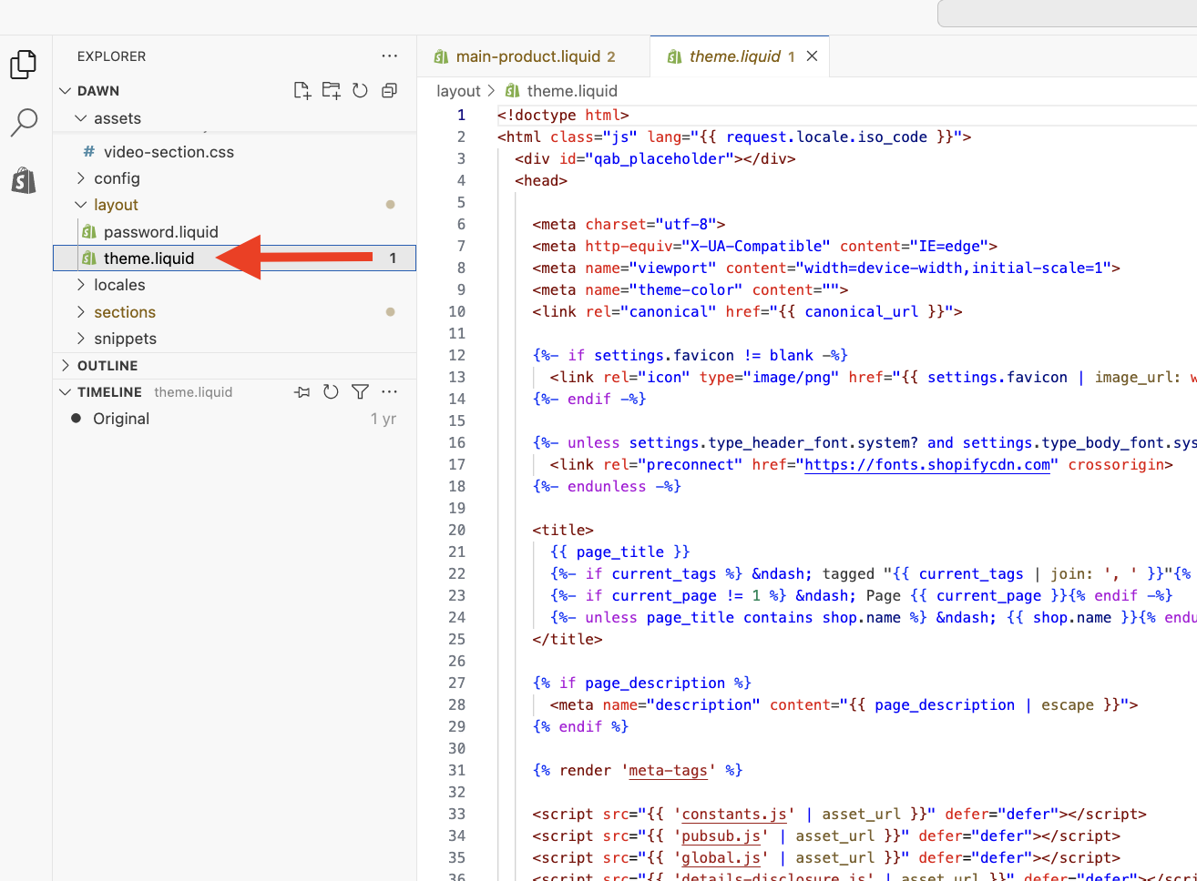
- From here, you need to find the top of the page. A line above the header or the announcement bar is usually a good place to begin.
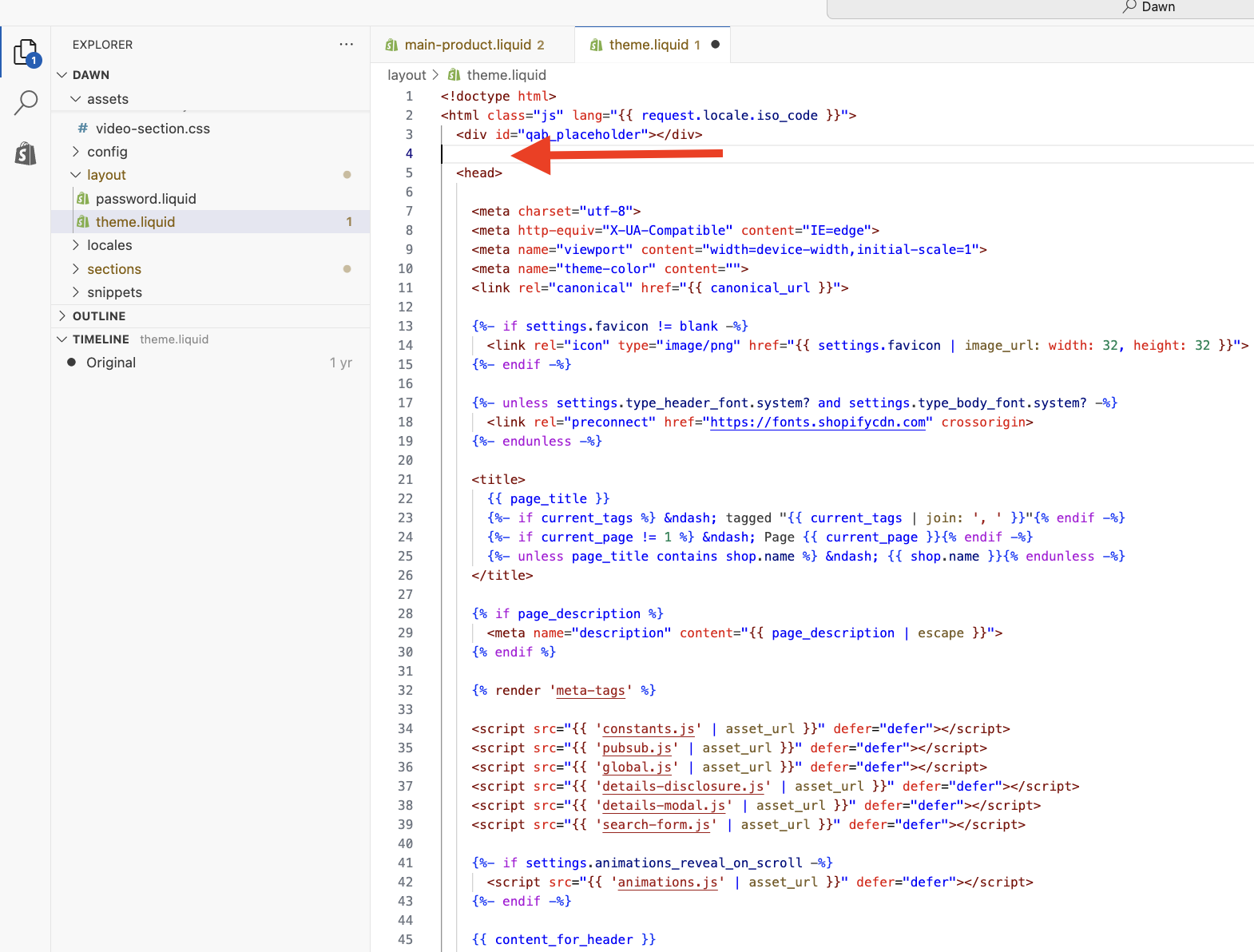
- In that area, paste this code:
<div id="ctb_placeholder"> </div>
<style>
@media only screen and (max-width: 768px) {
#ctb_placeholder{
height: 33.5px;
}
}
@media only screen and (min-width: 769px){
#ctb_placeholder{
height: 44px;
}
}
</style>
Like so:
- Save the changes to the theme and preview it to see how it looks.
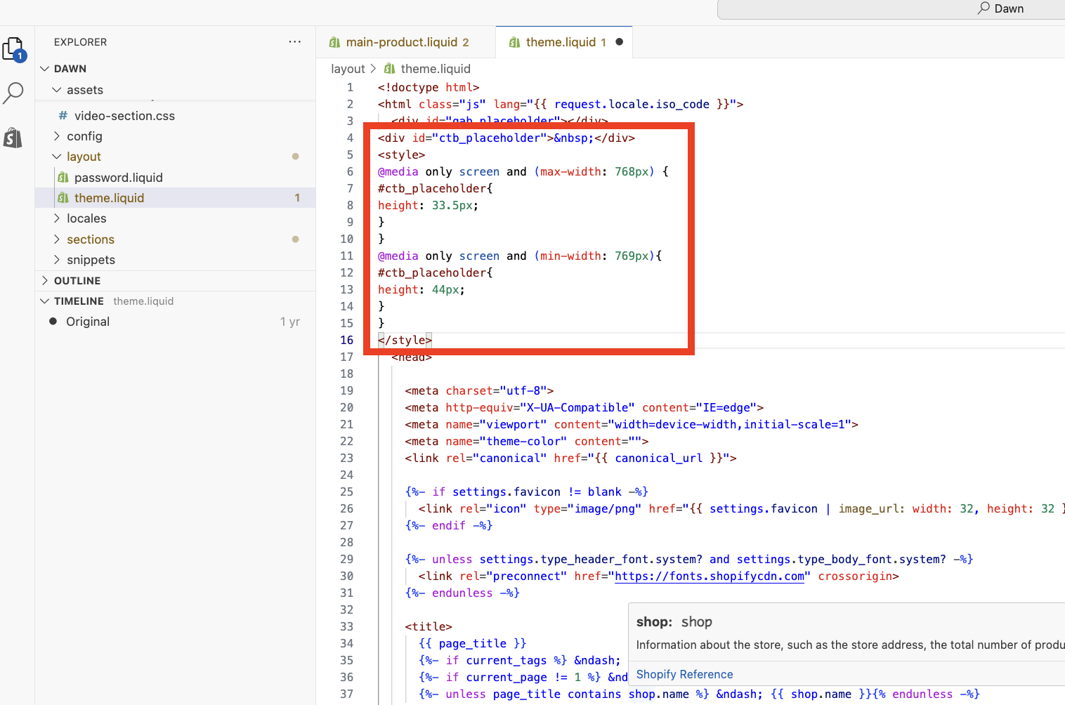
Keep the bar at the top (scrolling / sticky):
- Inside the Sections folder you'll find the file header.liquid. Open that file.
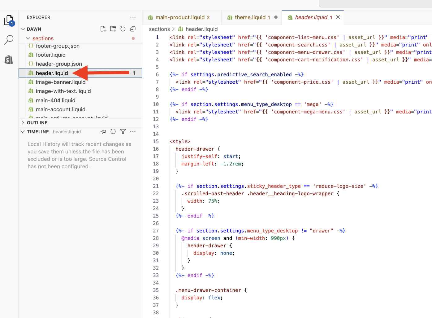
- Add some blank lines to the top of the file:
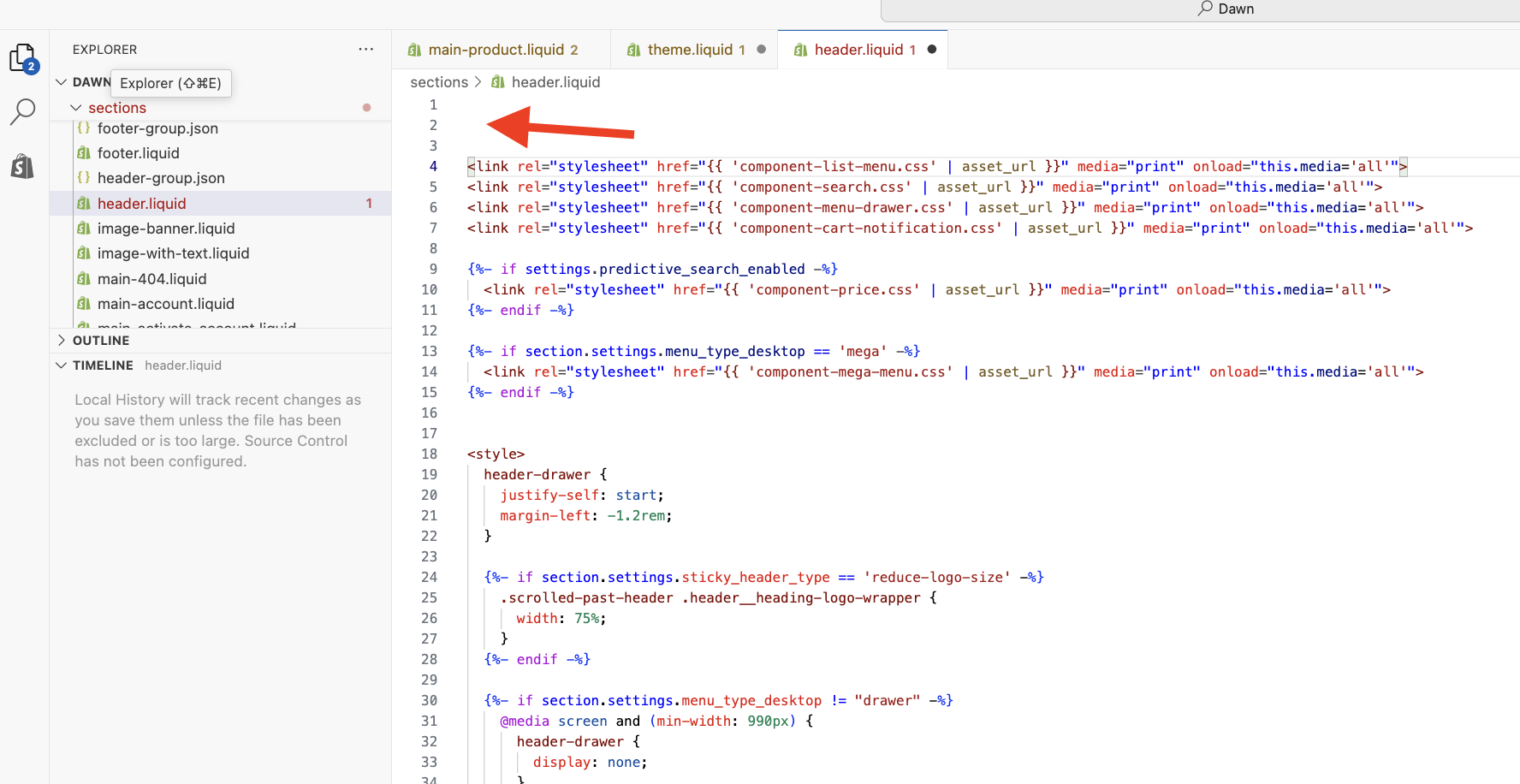
- Then, at the very top, paste in this code:
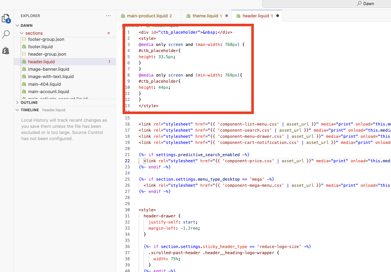
<div id="ctb_placeholder"> </div>
<style>
@media only screen and (max-width: 768px) {
#ctb_placeholder{
height: 33.5px;
}
}
@media only screen and (min-width: 769px){
#ctb_placeholder{
height: 44px;
}
}
</style>
Like so:
- Save the changes to the theme and preview it to see how it looks.
That's it! Please feel free to reach out at help@hextom.com if you have any further questions or concerns.